
THE evolution OF an internal brand
Gastalt
“The whole is greater than the sum of its parts.”
- Aristotle
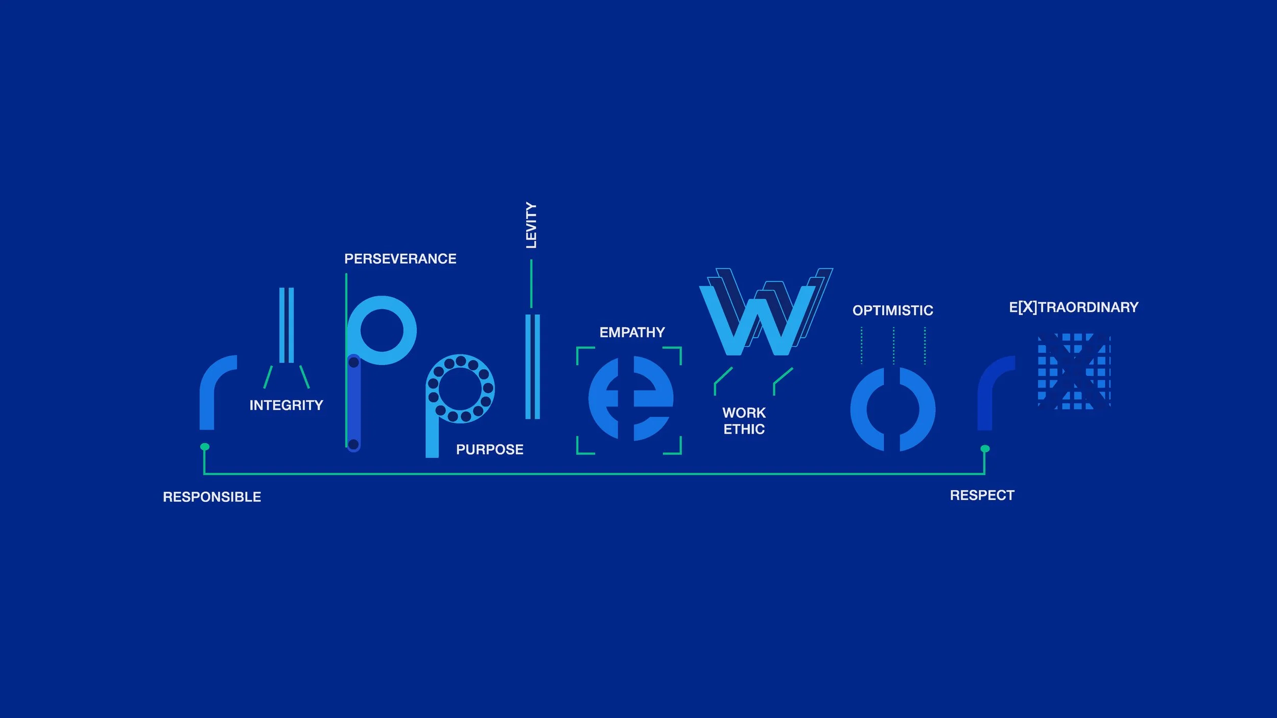
I applied the psychological theory of Gestalt to guide the development of RippleWorx’s internal brand, OneRipple—crafting a unified experience where values, visuals, and culture aligned to tell one clear, memorable story.
This approach solidified the brand from the inside out and strengthen the internal culture. It gave the teams something to stand on and rally around.
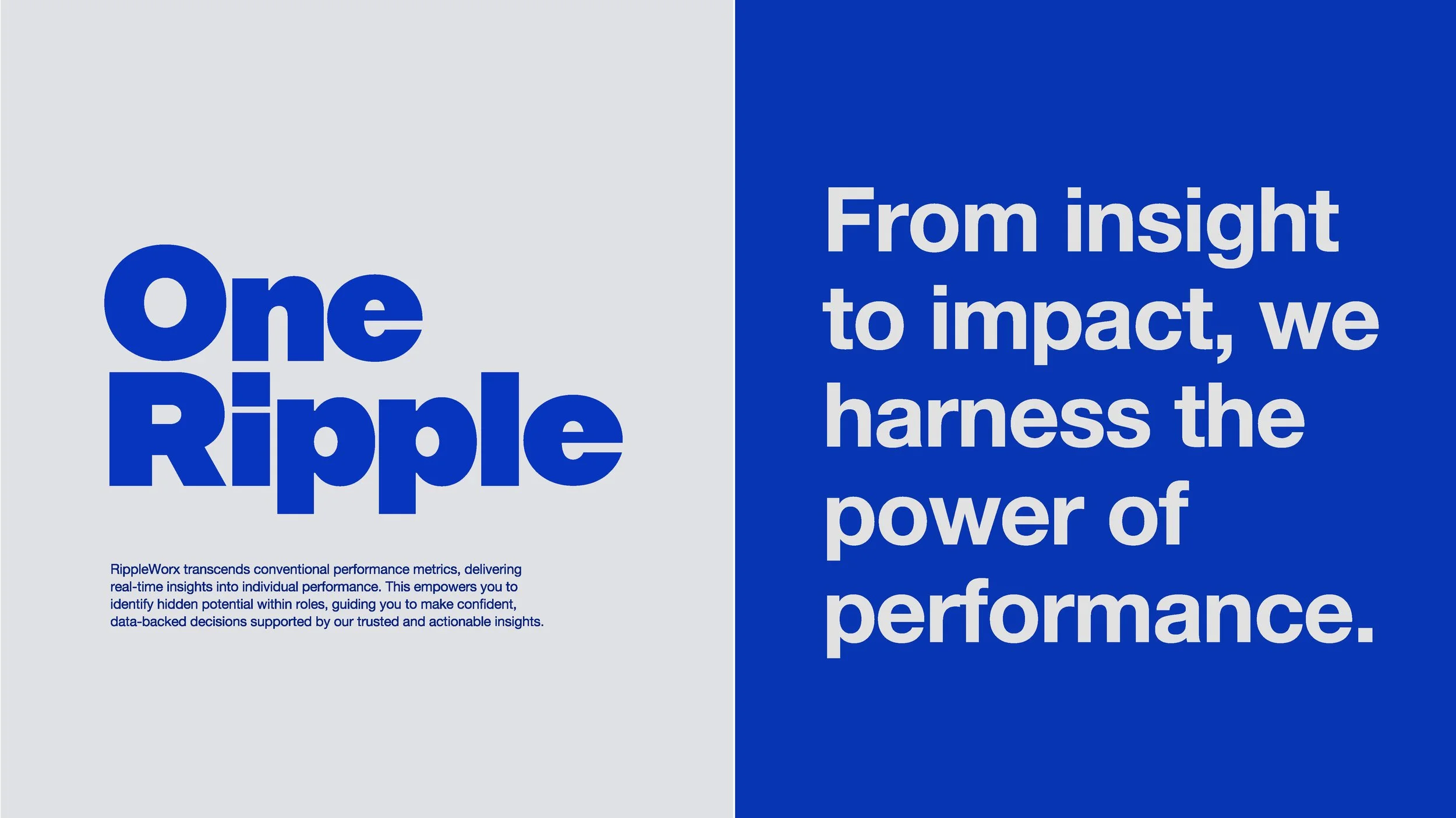
OneRipple
From insight to impact, this internal brand harnesses the power of performance to drive internal excellence and external engagement.
These brand guidelines were shared across the company to keep us grounded and aligned with our values and purpose.

Throughout my time at RippleWorx, Trusted, Actionable Insights wasn’t just a mantra—it was the North Star.
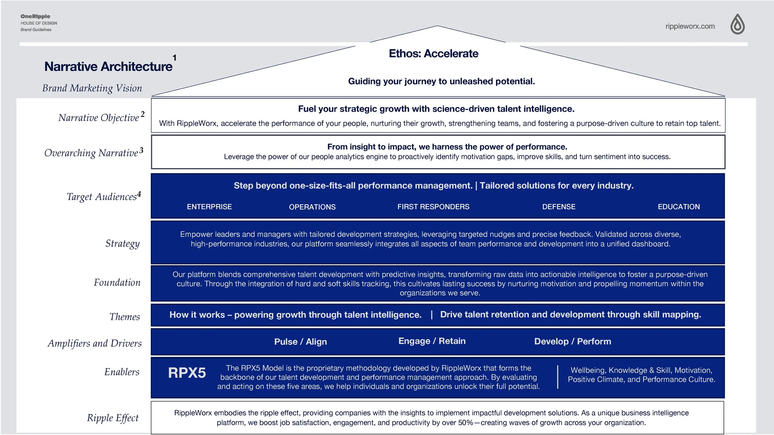
Building the Narrative Foundation
Message is like a house—one core belief, clear supporting points, and audience-specific angles. It keeps the story focused, flexible, and easy to act on.
How and when you say the message matters just as much as what you say.
Clean, Clear, Confident: The SaaS Case for Helvetica Neue
It’s not just a typeface—it’s a system for delivering confidence.
As Erik Spiekermann says in the Helvetica documentary, That neutrality is what makes it powerful. It doesn’t impose a personality on the brand; it reflects the user’s experience back to them—clean, reliable, and structured.
“There are people that think type should be expressive… I don't believe that. I think type should be tight and clean and clear.”
—Massimo Vignelli

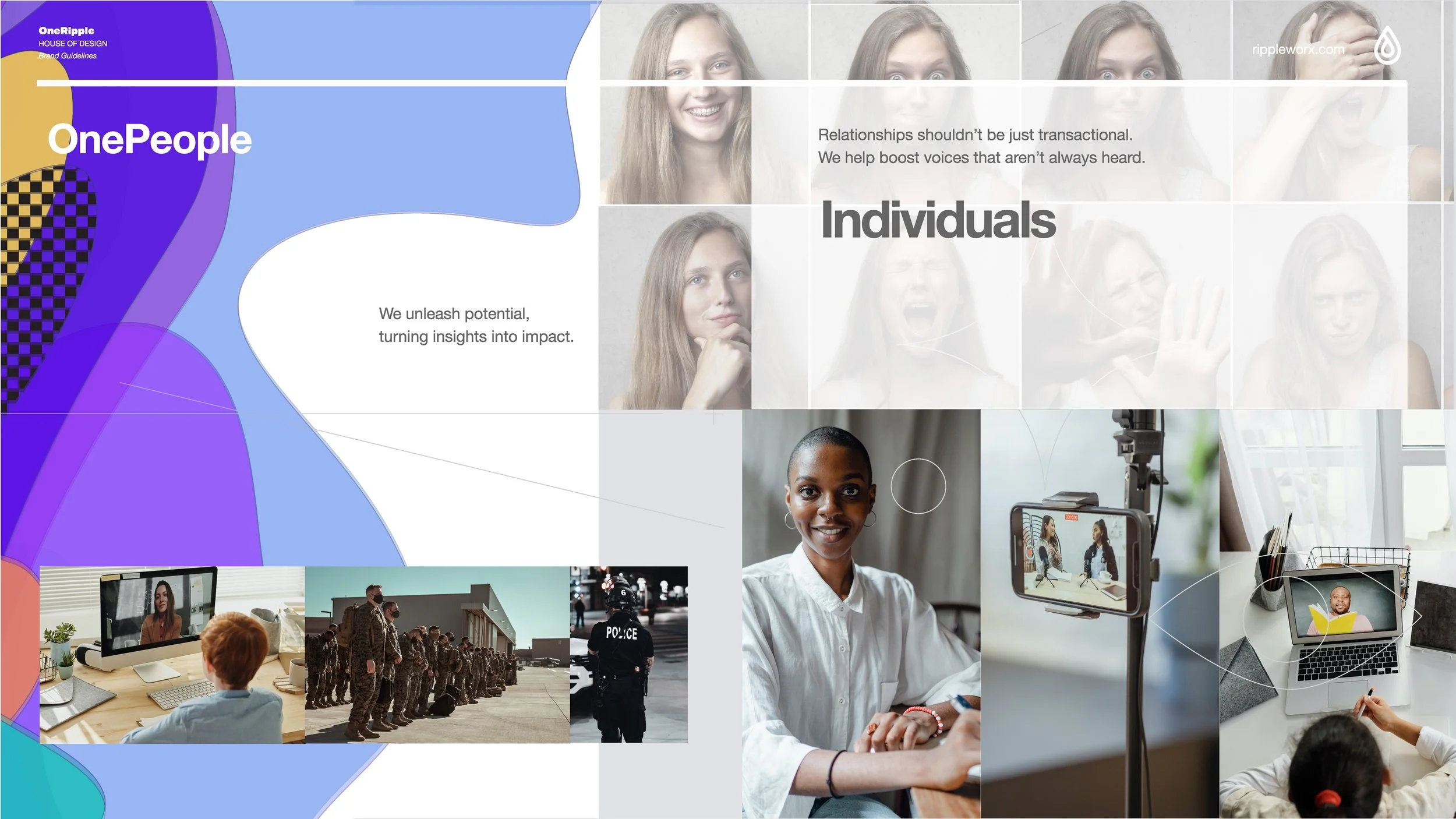
At RippleWorx, the brand was built to listen.
The RippleWorx platform does not just deliver insights—it fosters connection. By amplifying voices often unheard and moving beyond transactional touchpoints, I crafted a brand to reflect the human side of data.
Visually, I brought this to life through abstract, emotive imagery grounded in diversity. With clients spanning defense, law enforcement, retail, hospitality, and sports, the brand needed to adapt across industries while staying unmistakably human.
Voice, Tone, and Cadence
Voice is how we show up—confident, thoughtful, and purpose-driven. Tone flexes to meet the moment: confident when casting vision, clear when explaining details, and connected when inviting action. Cadence brings it all to life—varying pace and rhythm to keep the message human and real.

The best narratives start as invitations. Here is how I leverage each one to generate the most engaging and effective stories:
I use voice to show up consistently across every room in the house. It reflects the who in the story—confident, thoughtful, and purpose-driven. Voice stays the same, no matter the audience.
I use tone to meet my audience at the door. It shifts depending on who I am speaking to and what they need. When I am sharing the vision or framing the opportunity, I am the most confident. When I walk someone through the details, I am most clear. And when I invite people to take action or reflect, I am the most connected.
I use cadence to guide how the message flows. Varying my sentence length and rhythm to create energy or offer pause. Short, punchy lines carry confidence. Longer, more fluid lines build connection. Cadence helps the message feel human—not rehearsed.

It’s not just a palette; it’s a foundation.
Color is the soul of a brand and like typography it is a system that performs with both function and form.
When designing a color palette that was be used in both brand marketing and product design, there are several factors I had to consider—accessibility, emotional tone, scalability across light and dark modes, and how color communicates hierarchy and interaction within a product. It’s not just about choosing hues that look good—it’s about